9 Wedding Website Examples by Style (Real Pages You Can Open)
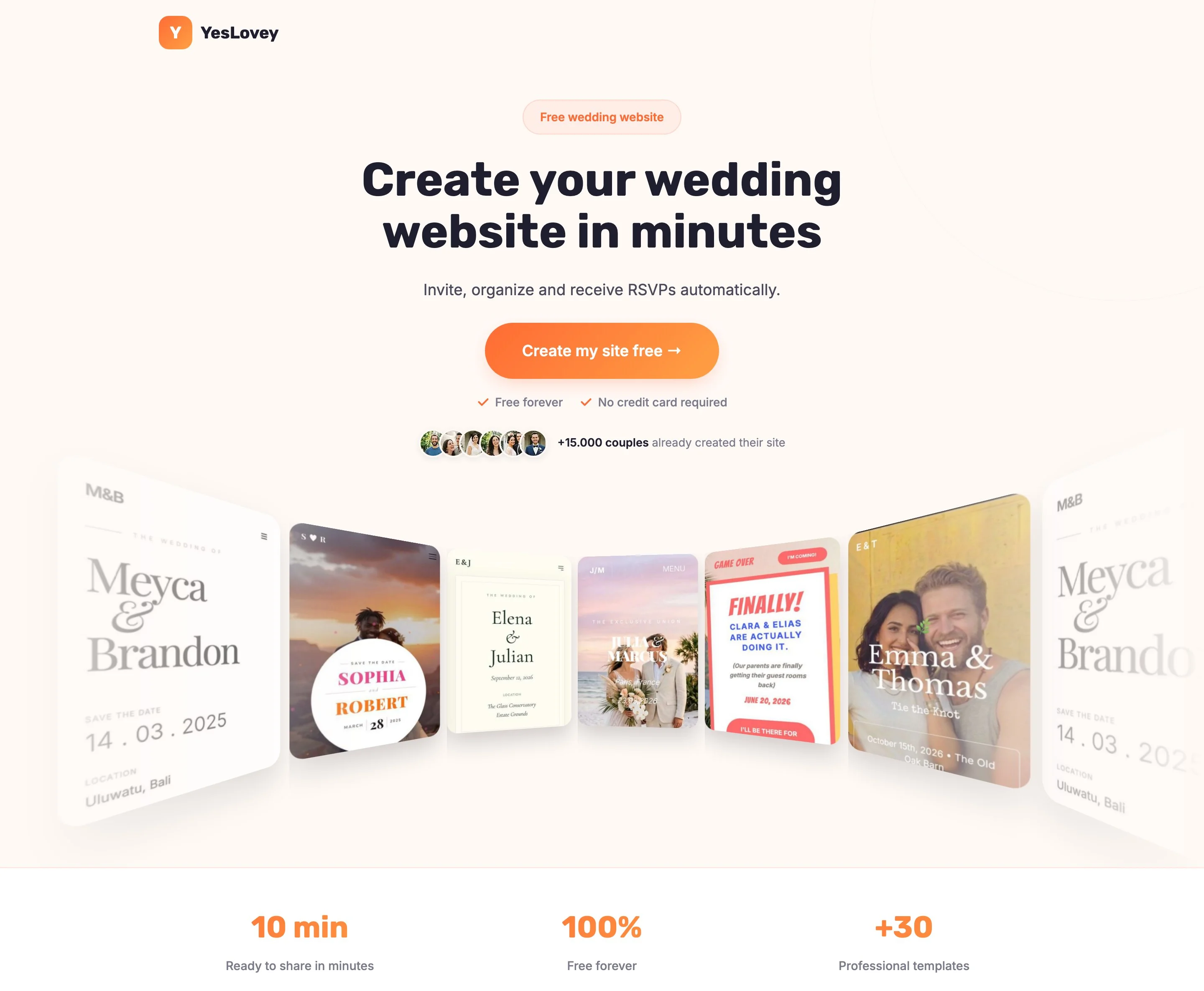
The fastest way to plan your own site is to look at wedding website examples sorted by style and steal what works. Below are 9 real examples — classic, minimalist, rustic, photo-heavy and destination — each one a live template built with the YesLovey editor that you can open, click through and publish with your own names and photos, available on the free plan unless noted.
Every example carries a short “why it works” note, so you can compare the styles on more than looks. At the end there is copy-paste wording for the welcome, our-story, travel, wedding party, registry and FAQ sections, because the writing is where most couples stall.
Key takeaways:
- A good wedding website puts names, date and venue on the first screen, an RSVP form a guest can finish in under a minute, and a layout that reads well on a phone.
- Pick the style by what you have: strong couple photos favor a photo-first template; no photos yet favors a typographic or minimalist one.
- Every section’s wording follows one rule: the useful information first, the charm limited to one sentence.
- A destination wedding website carries extra weight: flights, hotels and an FAQ belong on it from day one.
- You can build and publish these examples free unless noted: visual editor, RSVP with up to 60 confirmed guests and a free subdomain cost $0. Two templates below are Pro-only ($59 one-time) and are marked as such.
What a great wedding website looks like
A great wedding website answers a guest’s three questions without any hunting: where and when is the wedding, what do I need to know, and how do I confirm. That means names, date and venue on the first screen, an RSVP form that takes under a minute, and a design that works on a phone.
Those three criteria — clarity, RSVP, mobile — are the “why it works” vocabulary used for every example below. The channel matters more than ever: according to The Knot, 90% of wedding planning happened online in 2024, and your website is the one page you control end to end.
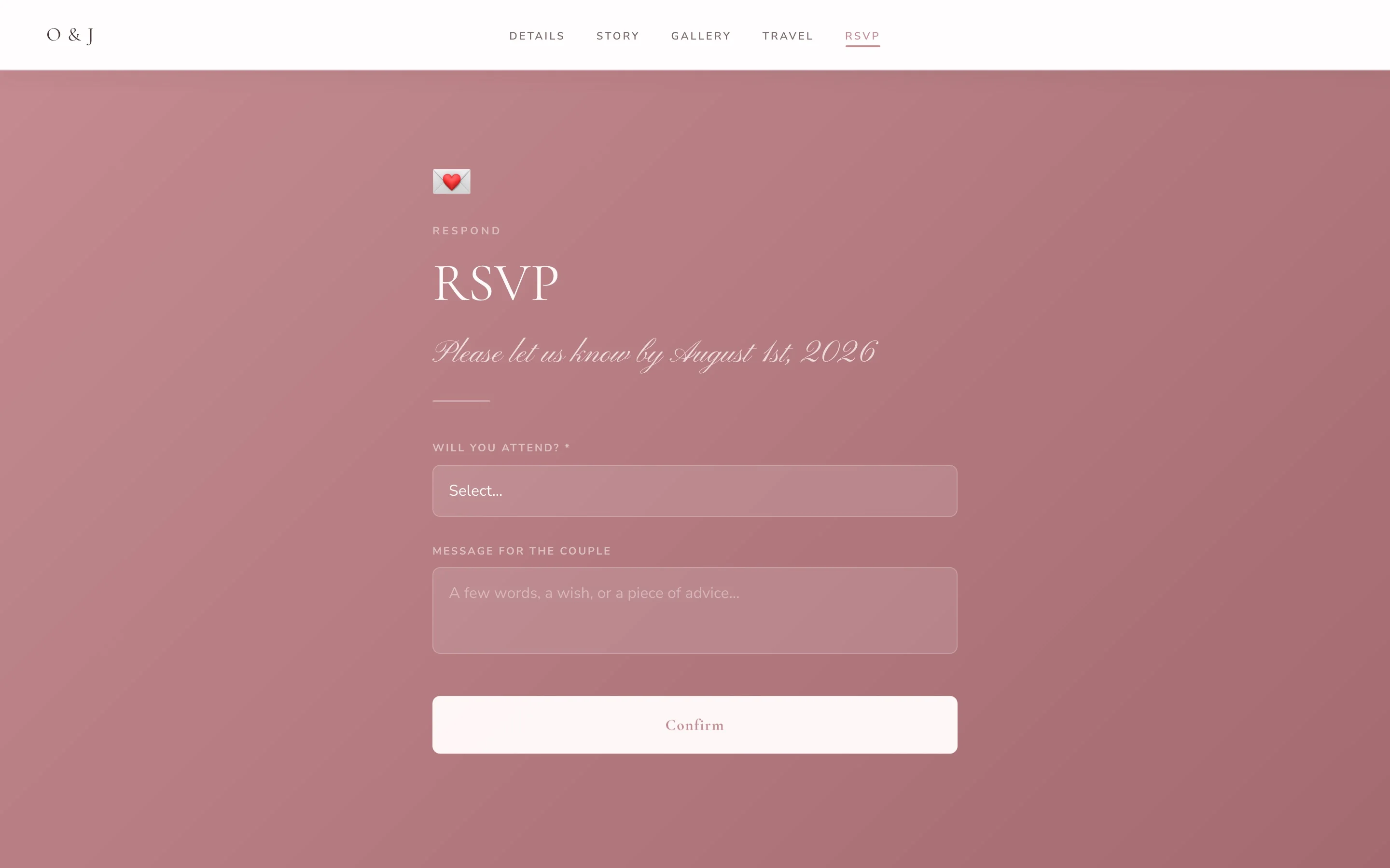
An RSVP form like this one replaces the WhatsApp thread and the spreadsheet. Every example in this list has one built in.
Classic and elegant wedding website examples
Classic wedding websites rely on serif typography, muted colors and generous spacing rather than loud graphics. They suit ballroom, estate and church weddings, and they age well: the screenshot you look back on in ten years still reads as formal and considered rather than trendy.
The ballroom classic
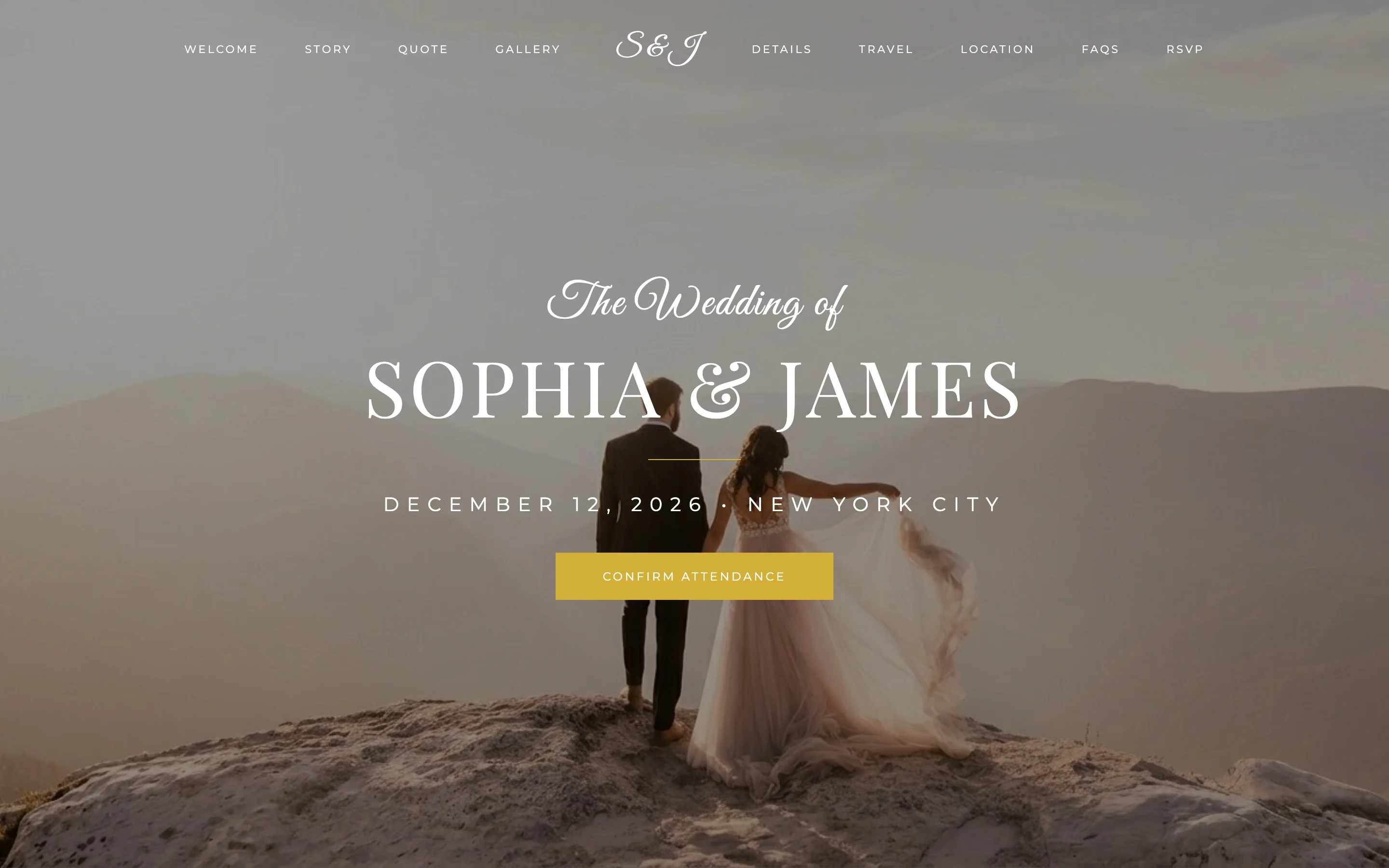
Sophia & James pair a script “The Wedding of” with tall serif capitals over a hazy mountain photo. A single gold button — “Confirm attendance” — sits right under the date, so the most important action on the site is also the most visible one.
Why it works:
- Names, date, city and the RSVP button all fit on the first screen (clarity + RSVP).
- The photo is desaturated behind the text, so the white type stays readable at any screen size (mobile).
The invitation-style layout
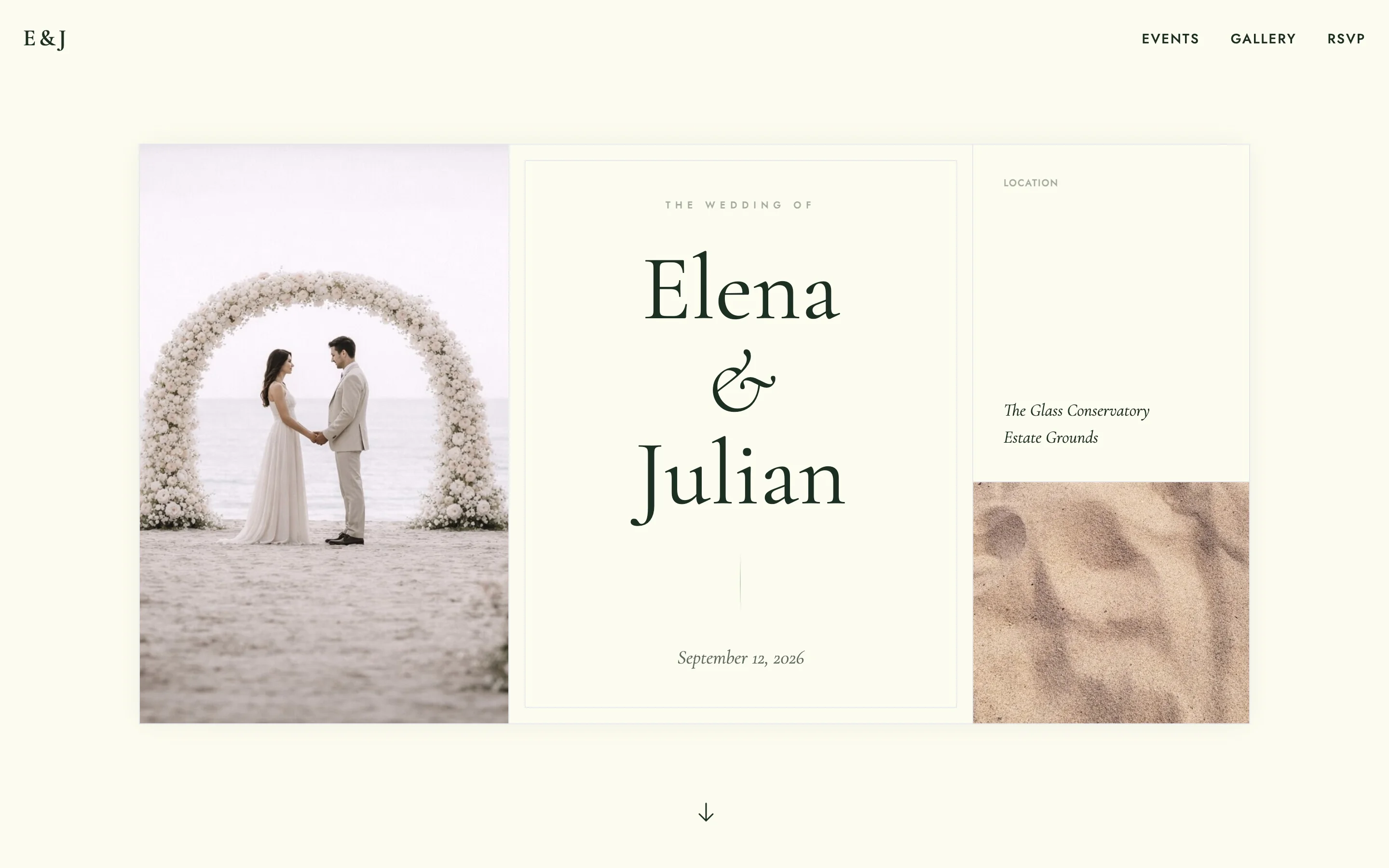
Elena & Julian borrow the language of printed stationery: a framed cream panel with “The wedding of” in letterspaced capitals, dark green serif names, and the ceremony photo set beside the card instead of behind it. It feels like the paper invitation and the website came from the same designer.
Why it works:
- The card layout keeps text on a plain background, the most legible combination there is.
- Guests who received a printed invitation get visual continuity, which builds trust in the details.
Minimalist wedding website examples
Minimalist wedding websites drop photography from the first screen and let typography carry everything. They are the right choice when you have no engagement shoot yet, when you prefer text over pictures, or when you want a site that looks deliberate rather than decorated. They also load fast on any connection.
The quiet typographic page
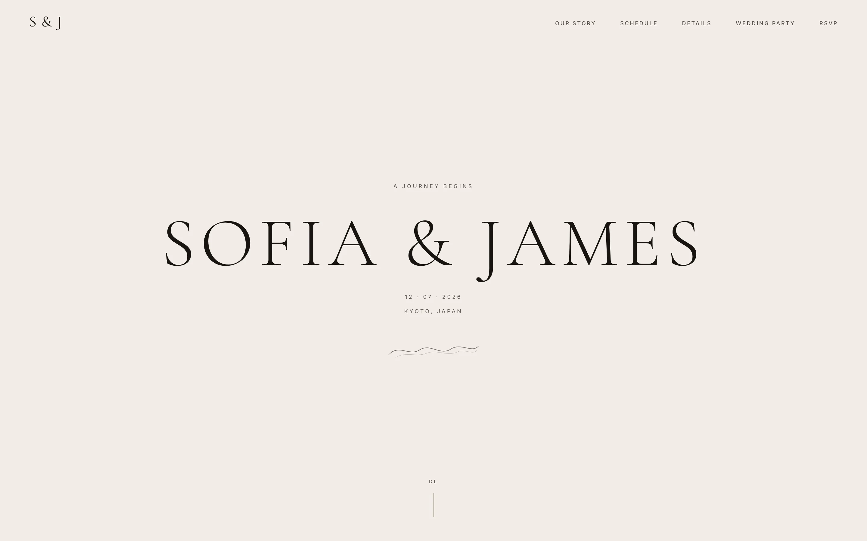
Sofia & James put nothing on the first screen except their names in thin serif capitals, the date and the city. No photo, no countdown, no button competing for attention. The restraint itself is the design.
Why it works:
- With no images to size and crop, the page reads identically on a 6-inch phone and a 27-inch monitor.
- It works on day one of planning, before you have a single couple photo you like.
Note: this is a Pro template, included in the $59 one-time plan rather than the free tier.
The graphic grid
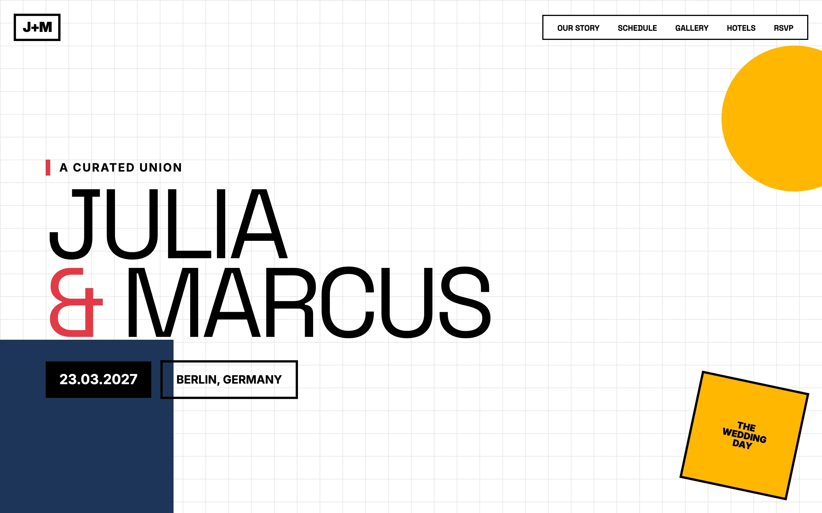
Julia & Marcus go Bauhaus: heavy black sans-serif names on a faint grid, with a yellow circle, a navy block and a red ampersand as the only decoration. The date and city sit in outlined boxes, like labels on a poster. It reads more like a design studio’s identity than a wedding invitation, which is exactly the point for couples who care about graphics.
Why it works:
- High-contrast type with zero photography stays crisp on every screen (mobile).
- The unusual look makes guests actually scroll, and the RSVP link is pinned in the top navigation the whole way down.
Rustic and romantic wedding website examples
Rustic wedding websites lean on warm photography, earthy color and one informal touch — a typewriter font, a hand-drawn detail — to signal a relaxed celebration. They fit barn, farm and vineyard venues, and they tell guests what to expect from the day before the dress code section says a word.
The barn wedding
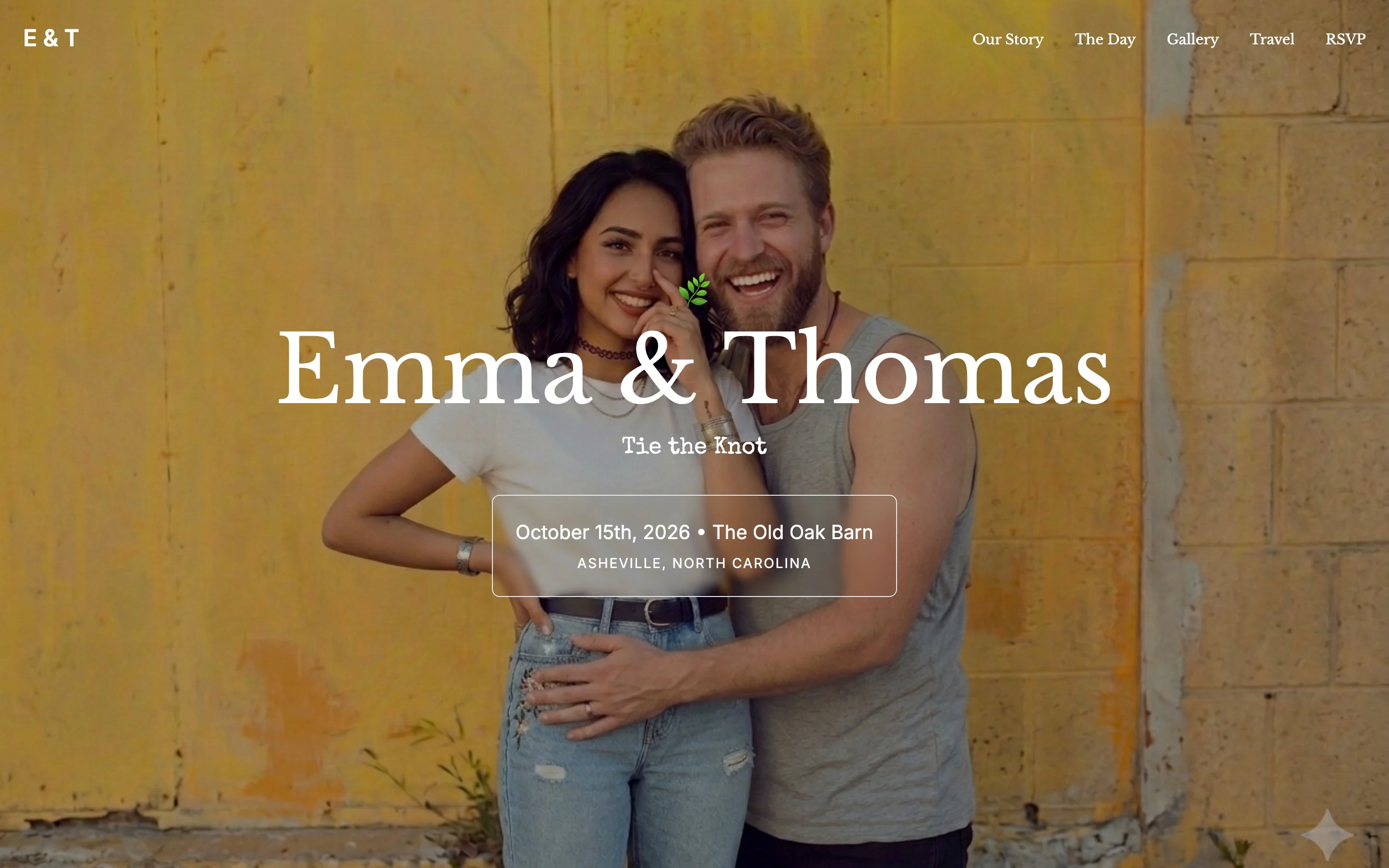
Emma & Thomas use a casual couple photo against a weathered yellow wall, with “Tie the Knot” set in a typewriter font under their names. The venue — The Old Oak Barn — is named inside a simple outlined box on the first screen, so the rustic setting is part of the announcement itself.
Why it works:
- The informal photo sets expectations: this is jeans-and-laughter, not black tie.
- Date, venue and town all appear before any scrolling (clarity).
The soft romantic
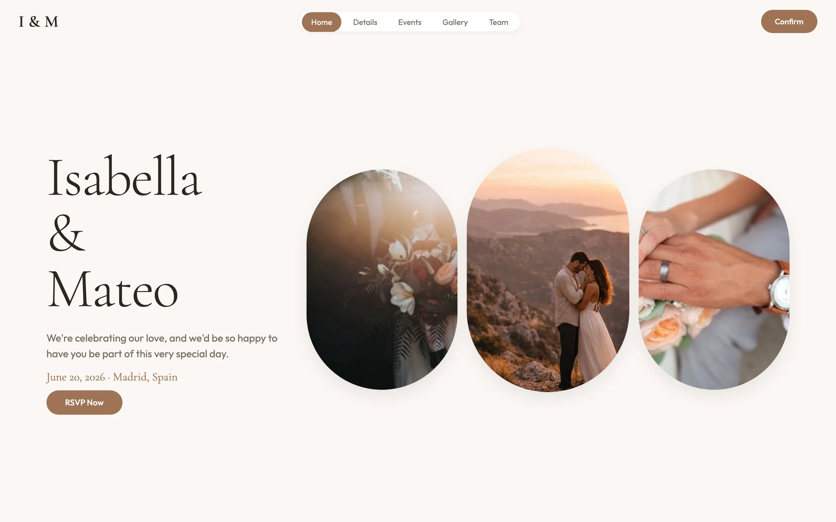
Isabella & Mateo split the screen: names and a short welcome line on the left, three arch-shaped photos in warm tones on the right. The arches echo ceremony architecture, and a one-sentence greeting (“we’d be so happy to have you be part of this very special day”) does the emotional work a hero photo usually does.
Why it works:
- Three small photos are easier to source early in planning than one perfect full-screen shot.
- The welcome sentence plus a visible “RSVP Now” button answers what the page is for within seconds (RSVP).
Photo-heavy and modern wedding website examples
Photo-first wedding websites make one image do the talking: a full-screen couple photo with names set directly over it. They are the best use of a good engagement shoot, and the riskiest choice without one. The modern-editorial variant adds oversized type for a magazine-cover effect.
The full-bleed photo
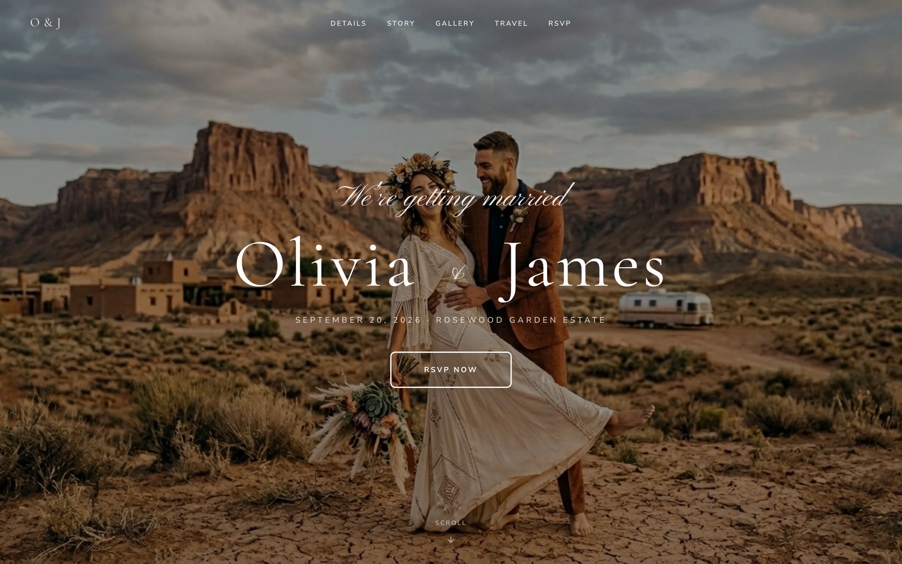
Olivia & James run their desert engagement photo edge to edge, with “We’re getting married” in script and their names in large white serif over the sky. Date, venue and an outlined RSVP button stack neatly beneath the names. If you have one photo you love, this template is built around it.
Why it works:
- The photo answers “what kind of wedding is this?” instantly, before a single word is read.
- Everything a guest needs — names, date, venue, RSVP — sits in one centered column that survives any screen width (mobile + RSVP).
Note: this is a Pro template, included in the $59 one-time plan rather than the free tier.
The editorial cover
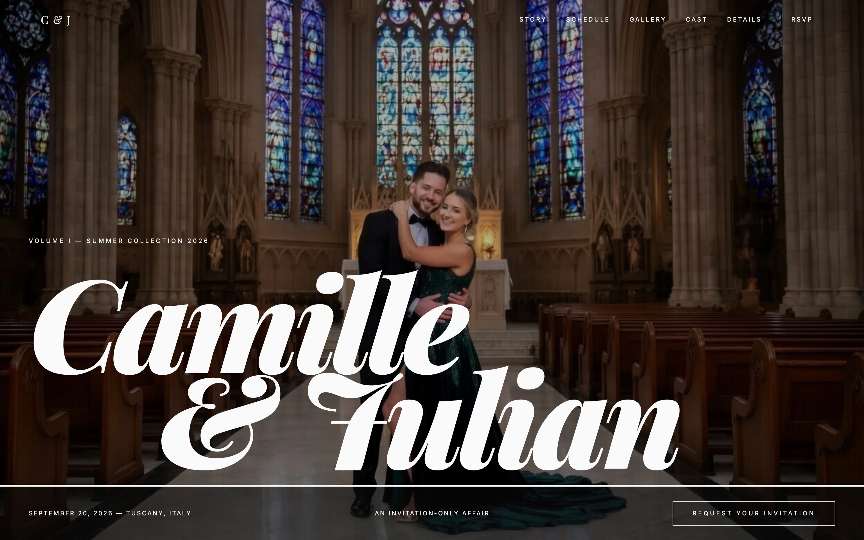
Camille & Julian set their names in enormous swash script across a cathedral photo, with a kicker line above (“Volume I — Summer Collection 2026”) and “Request your invitation” as the call to action. The whole page plays at being a fashion magazine, and the joke lands because the execution is disciplined.
Why it works:
- The oversized type is legible even where the photo behind it is busy.
- The themed wording (“cast” instead of wedding party, “lookbook” instead of gallery) carries one idea through every section, which is what separates a theme from a gimmick.
Destination wedding website example
A destination wedding website has more work to do than any other kind: guests need flights, accommodation, local logistics and answers before they can even say yes. The Knot Worldwide’s 2026 Real Weddings Study puts the average US guest list at 117 people. Moving that many people to another country takes one authoritative page.
The Santorini wedding
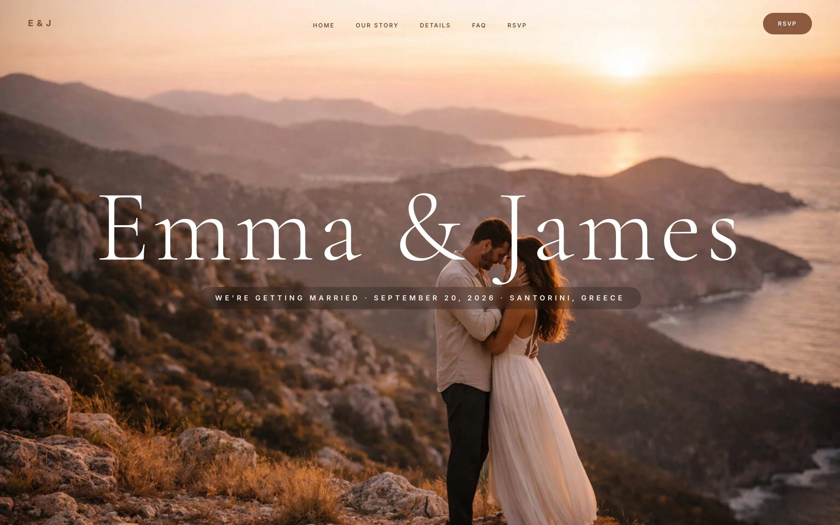
Emma & James open with a sunset photo of the Santorini coast and put the location in the same line as the date: “September 20, 2026 · Santorini, Greece”. The navigation includes an FAQ item on the first screen, because for a wedding abroad the questions start the moment the link is opened.
This is the pattern to copy if your guests are crossing a border — an American couple marrying in Spain or France, or families flying in from two countries. The website becomes the single source of truth for flights, hotels and schedules, instead of forty individual text conversations.
Why it works:
- Naming the destination in the hero turns the first screen into the trip announcement, which is the decision guests actually have to make.
- FAQ and travel sections are promoted to top-level navigation, matching what guests at a destination wedding actually need first.
Wording examples for every section
Every wedding website section follows the same wording rule: say the useful thing first, keep the charm to one sentence, and never make a guest scroll for a time or an address. Here is copy-paste wording for the welcome, our-story, travel, wedding party and registry sections, plus where to find full FAQ examples.
Welcome message
Two options for the short text under your names — one warm, one playful:
We are getting married, and the day will only be complete with you in it. Everything you need is on this page: the where, the when, and the button that tells us you are coming.
Welcome to the only wedding website that will ever matter (to us). Have a look around, note the date, and please RSVP before your calendar fills up with lesser plans.
”Our story” text
Keep it at 80–150 words, with one specific detail only the two of you know, and cut anything that could describe any couple on earth. Two ready-to-adapt texts — one plain, one in timeline form:
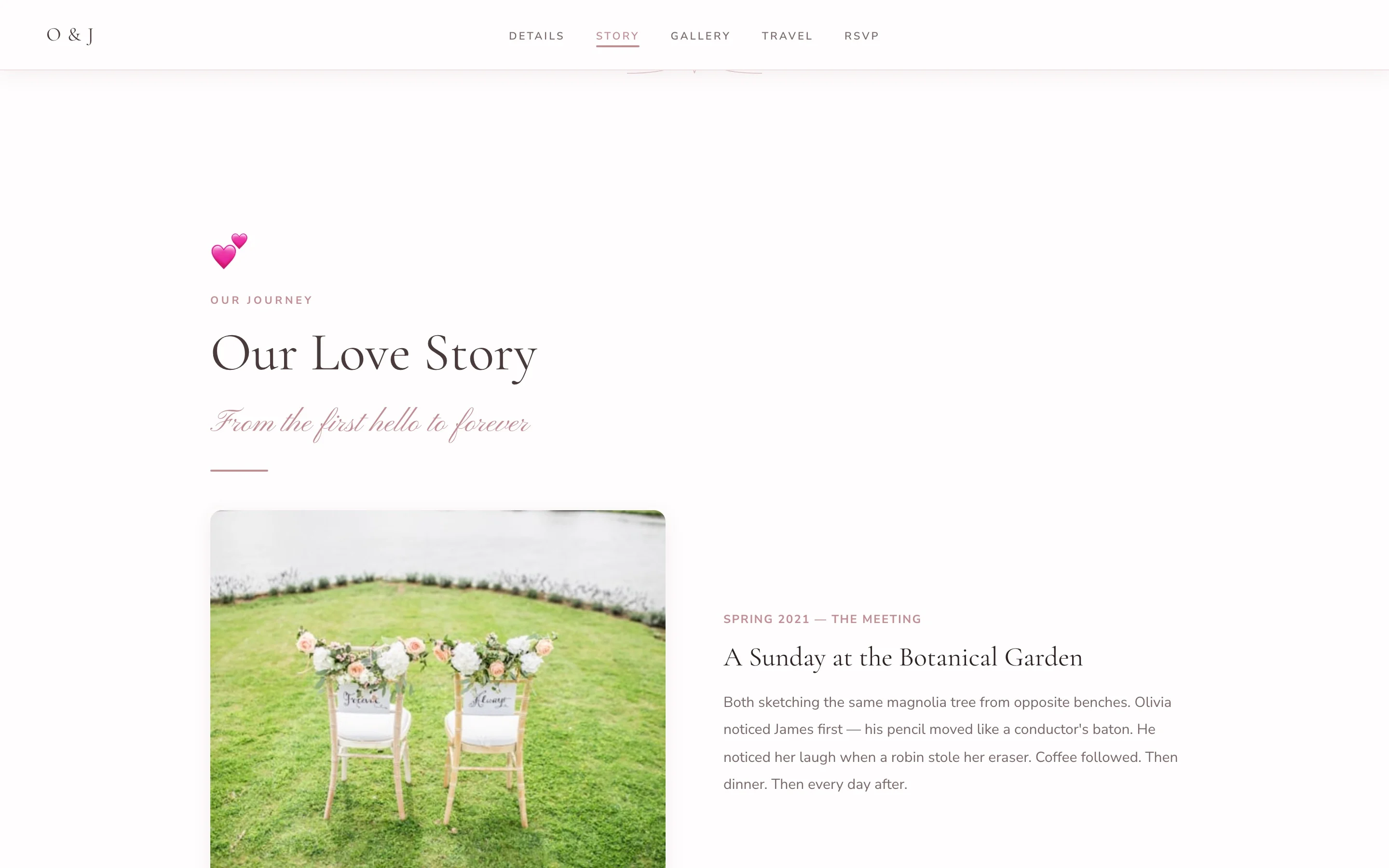
We met at a friend’s housewarming in 2021, argued about the right way to load a dishwasher, and have been arguing about it happily ever since. Somewhere between then and now, home became wherever the other one was. On June 12th we are making it permanent, and we want you there.
2019. We meet at Ana’s birthday. Marco spills a drink on Elsa’s shoes and apologizes for a full ten minutes.
2020. Video calls every night for four months. We watch the same films in two apartments, hitting play at the same second.
2022. We move in together. The plant we bought that week is somehow still alive, which we take as a sign.
2025. On the same street corner where the drink was spilled, Marco kneels. Elsa is wearing, deliberately, the same shoes.
2026. You are reading our wedding website. See you on the dance floor.
Travel and accommodation
The ceremony and reception both take place at Finca El Roble, 20 minutes from Seville airport. We have reserved rooms at two nearby hotels — mention “the Serrano wedding” when booking for the group rate. A shuttle leaves the cathedral square at 4:30 pm and returns at 1:00 am and 3:00 am, so nobody has to choose between dancing and driving.
Wedding party bios
Keep each one to two sentences: the relationship, then one detail with affection in it.
Claire — maid of honor. The bride’s sister and the first person to hear about the groom, roughly nine minutes after the first date ended. If the schedule runs on time, thank her.
Dani — best man. College roommate, godfather of the couple’s dog, and the reason the proposal stayed secret for five whole months, a personal record.
Registry note
Your being there is genuinely the gift. If you would like to give something more, there is a registry linked below — and if you prefer to contribute to the honeymoon fund instead, our bank details are there too. No wrapping paper required.
FAQ section
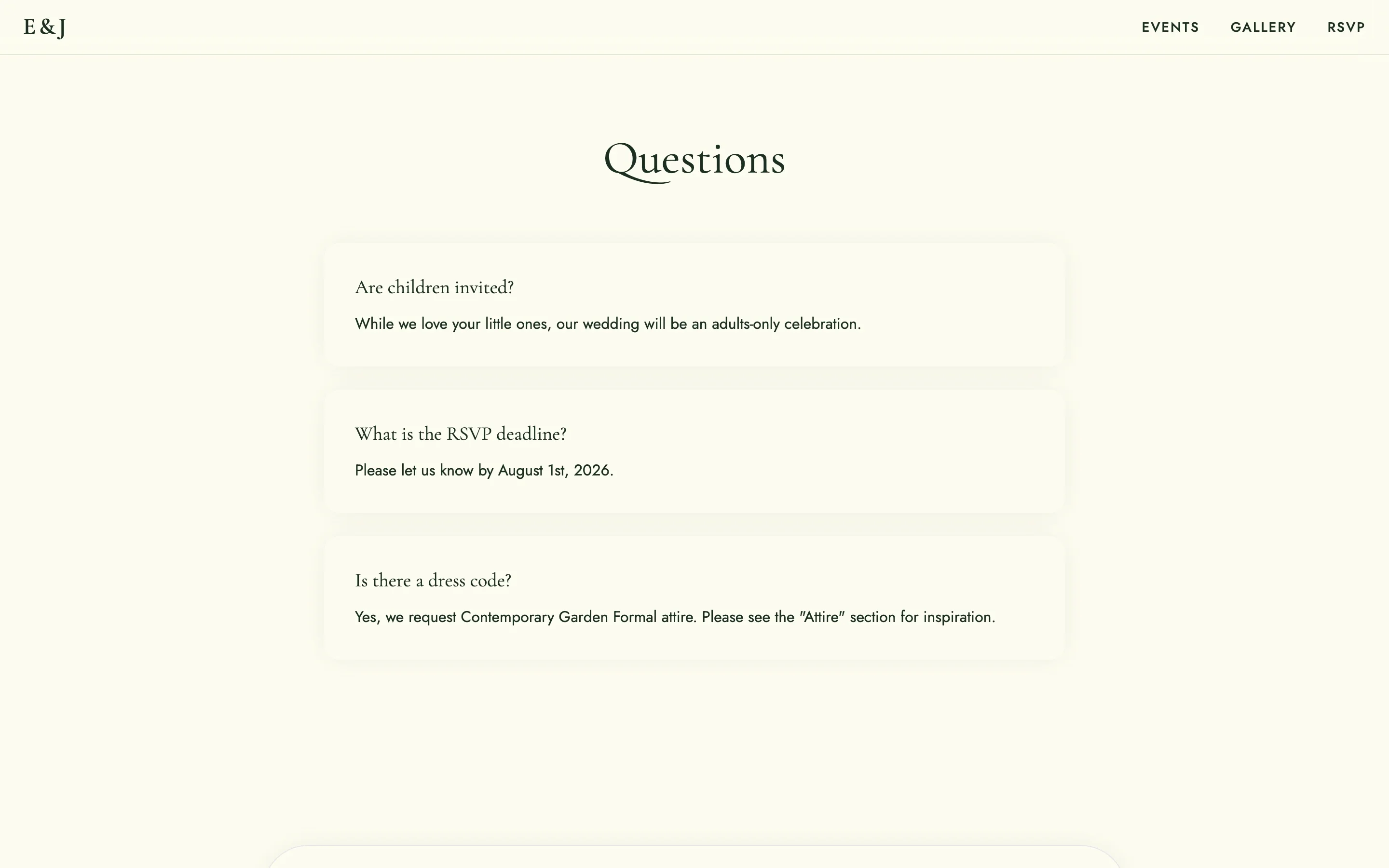
The FAQ is where you answer the questions you would otherwise repeat twenty times: dress code, kids, parking, RSVP deadline, weather. Answer each in one or two sentences, in the same order guests will worry about them. We keep a dedicated guide with ready-made questions and answers in wedding website FAQs.
How to build your wedding website step by step
You can go from a blank page to a published wedding website in an afternoon: pick a template, replace the placeholder text and photos in the visual editor, and publish to a free subdomain. No code, no designer. Here is the sequence:
- Choose the style first. Use the gallery above as the shortcut: good couple photos point to photo-first, no photos yet points to minimalist or typographic.
- Write the first screen. Names, date, city, RSVP button. Everything else can wait.
- Paste and adapt the texts. The section wording above is meant to be edited, not admired.
- Publish early and keep editing. The free plan includes the templates, the full visual editor, an RSVP form with up to 60 confirmed guests including companions, and a free subdomain (with a small watermark). Pro is a $59 one-time payment, not a subscription.
- Plan the room once RSVPs arrive. When confirmations start coming in, our free seating chart tool turns the guest list into a table plan.
If you are still comparing platforms first, our Zola vs The Knot breakdown covers the two biggest US alternatives.
Create your wedding website free
Templates ready to edit and publish. No credit card required.